
____________________________________________
Communication agency Des Cheval approached me to design the visual identity for one of their clients, a notary practice based in Tours. Their problematic was to create an identity that was modern, and carried the codes of an architectural practice rather than the traditional notary aesthetic. The new brand would also have to relate directly to their offices location.
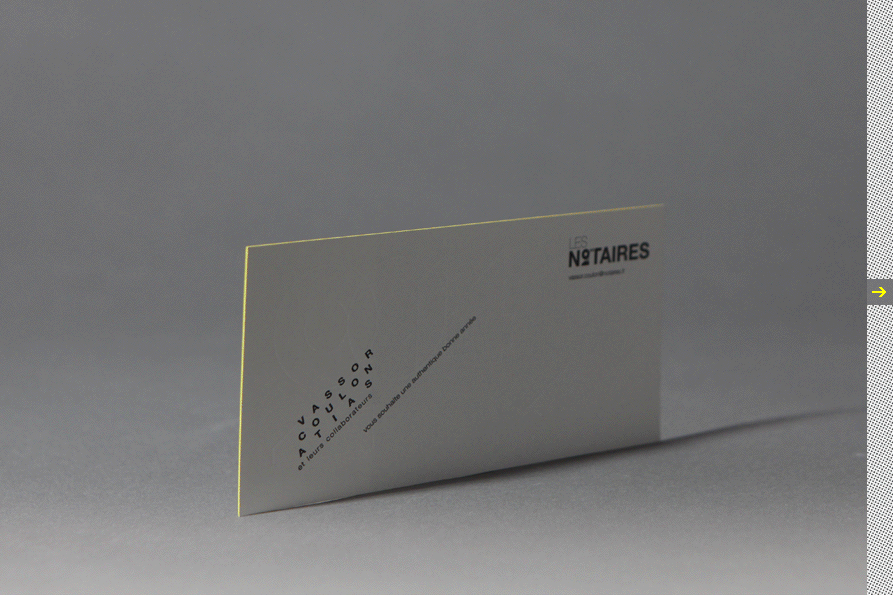
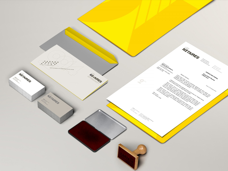
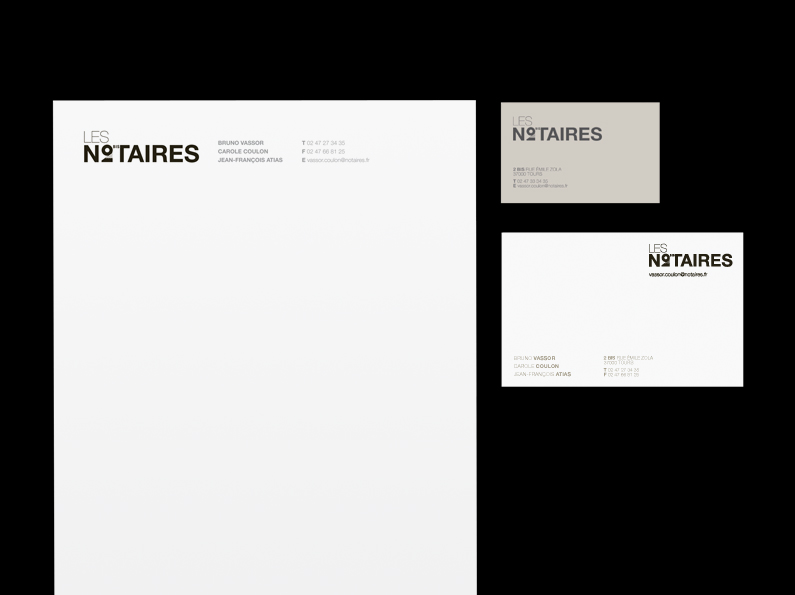
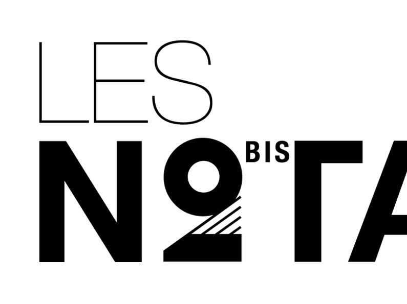
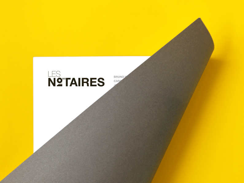
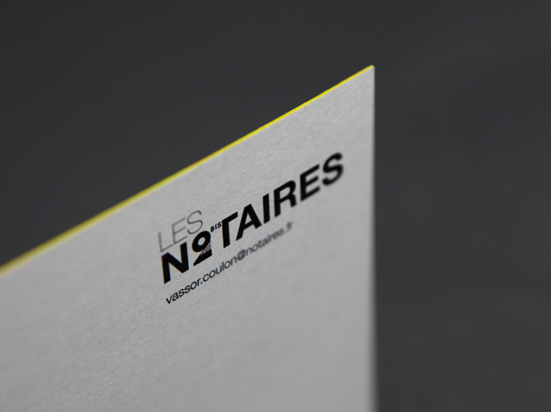
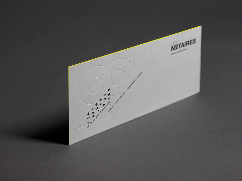
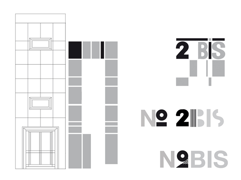
The design is an echo to the rhythm of the building’s façade, with a Cassandre like approach to typography, resulting in the combination of “N°2 Bis” and “Les Notaires”. The stationery and collateral's clean design and subtle details (embossing, edge painting, dual colour paper) convey the sense of timelessness inherent to the function of notary, whilst the bold colour contrast give it a modern edge.
Work includes:
Business cards, letterhead, compliment slip, new year greetings card, stamp, files and folders.
____________________________________________