

____________________________________________
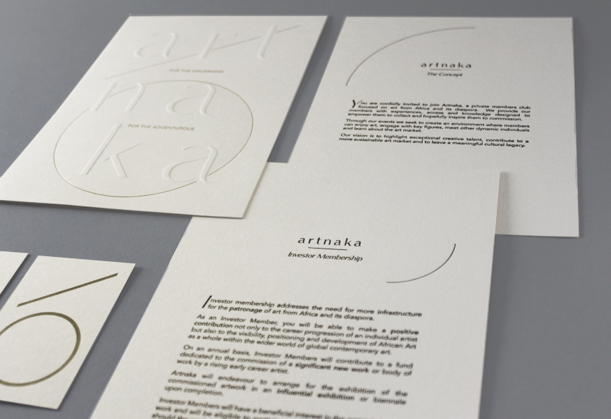
Artnaka is a private members platform focused on art from Africa and its diaspora.
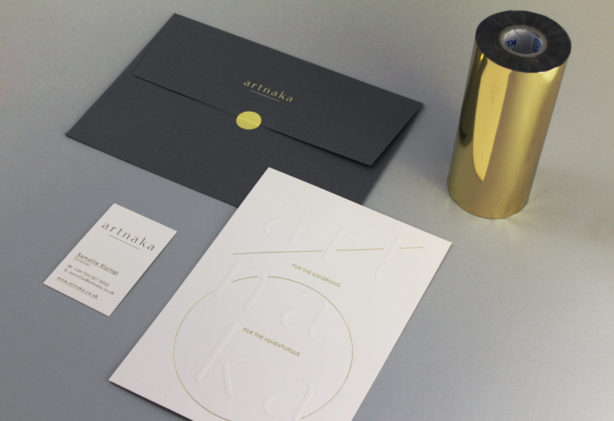
Elegance, attention to detail and quality of craftmanship, were the prerequisite in designing a brand identity that would hold its own in the art market.
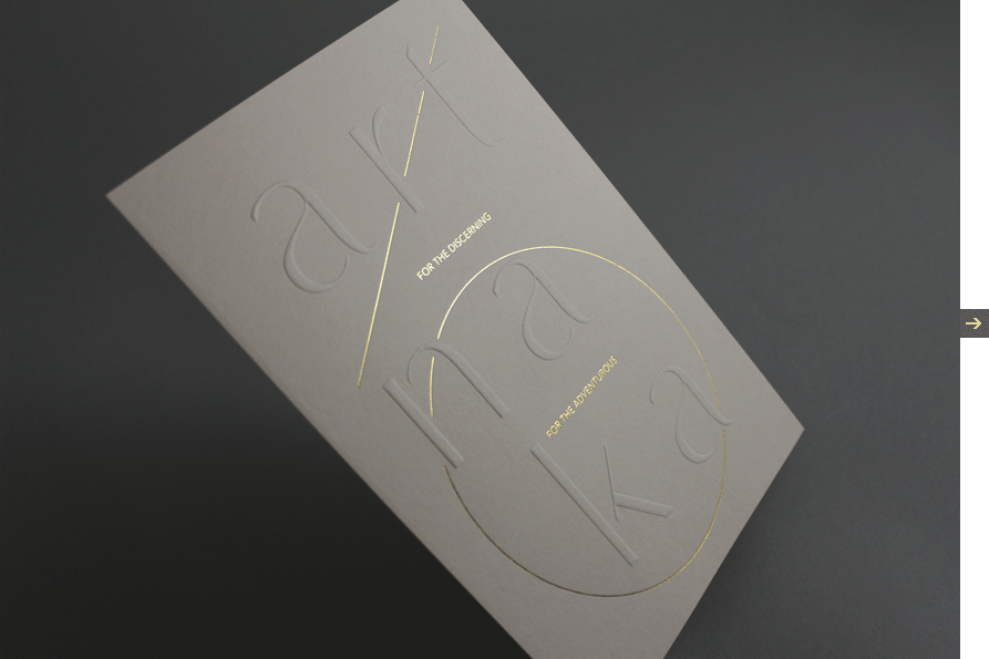
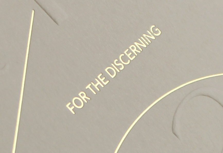
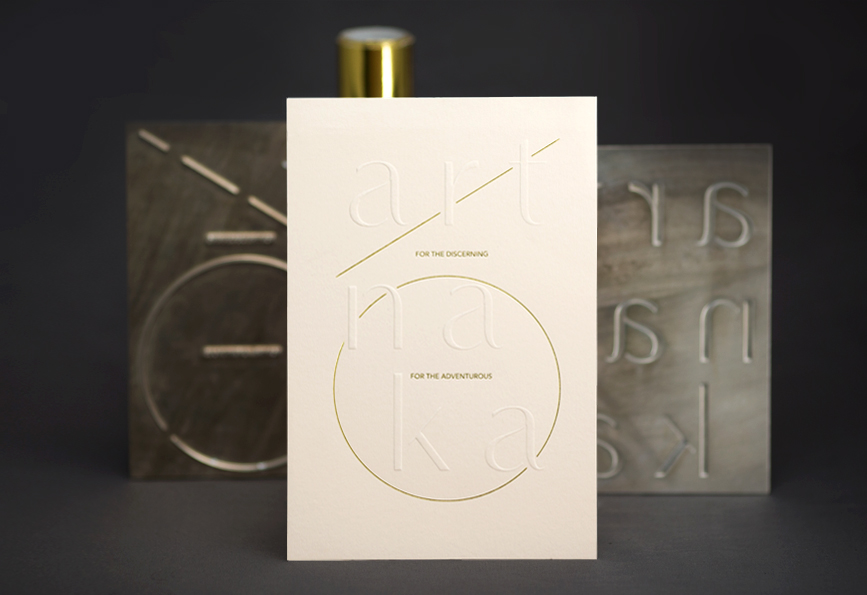
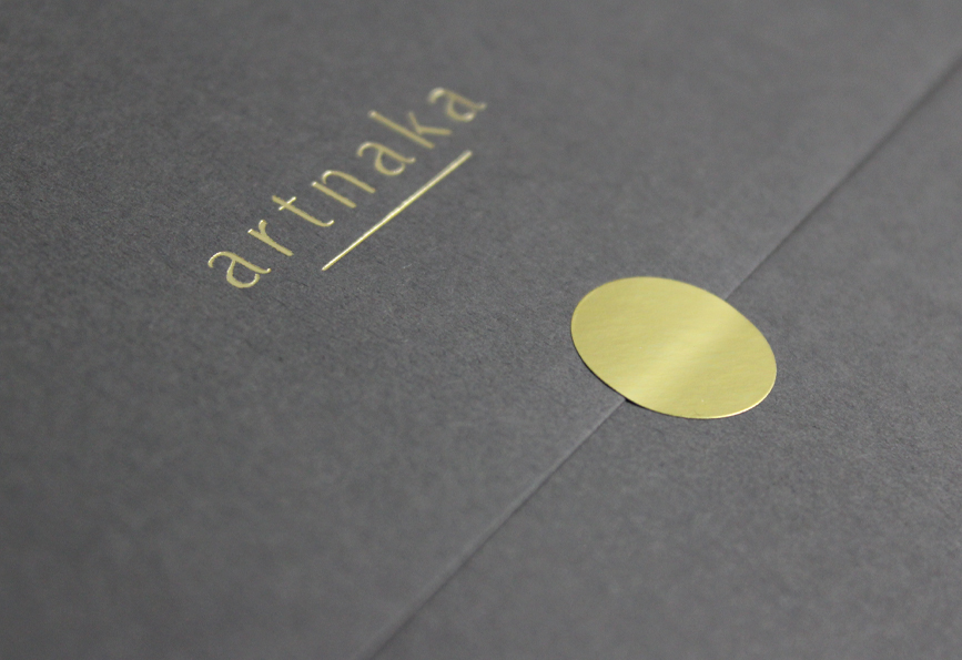
The design is a nod to the golden section, with simple use of typography and subtle graphic elements that serve to highlight the company's motto : "For the discerning. For the adventurous".
A purity of form which is carried through to the concept card, from the use of vellum white paper, to the subtle emboss and minimalist gold highlight.
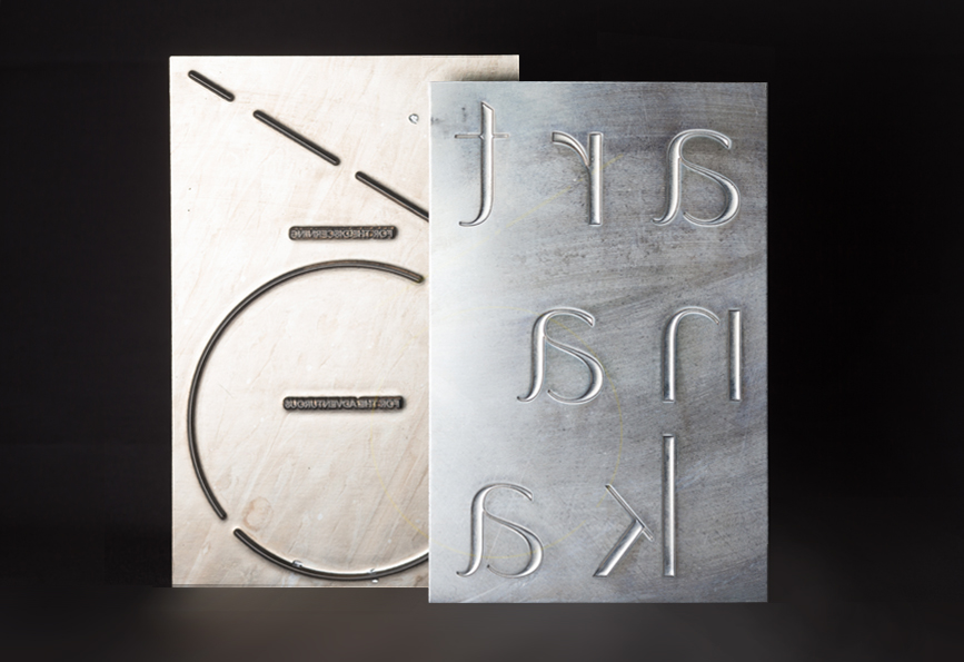
The cards and enveloppes of the membership pack were printed on letterpress by violet solide, using a combination of gold foil stamping and embossing, on gfsmith's colorplan paper.
____________________________________________